Plotting raw data
This notebook focuses on plotting raw measurements (VOD calculation and plotting is covered in the next one)
import gnssvod as gv
import pandas as pd
import xarray as xr
import numpy as np
import matplotlib.pyplot as plt
from matplotlib.collections import PatchCollection
import matplotlib.dates as mdates
The first step is to load all files of the merged data that were saved as a NetCDF.
We can read them as a series of xarray datasets.
ds = xr.open_mfdataset('data_RINEX2.11/Dav_paired/*.nc',combine='nested',concat_dim='Epoch')
ds
<xarray.Dataset> Size: 9MB
Dimensions:    (Station: 2, Epoch: 1441, SV: 77)
Coordinates:
  * Station    (Station) <U9 72B 'Dav1_Grnd' 'Dav2_Twr'
  * SV         (SV) <U3 924B 'C06' 'C07' 'C09' 'C10' ... 'R23' 'S23' 'S27' 'S36'
  * Epoch      (Epoch) datetime64[ns] 12kB 2021-04-28T21:07:00 ... 2021-04-29...
Data variables:
    S1         (Station, Epoch, SV) float64 2MB dask.array<chunksize=(2, 692, 55), meta=np.ndarray>
    S2         (Station, Epoch, SV) float64 2MB dask.array<chunksize=(2, 692, 55), meta=np.ndarray>
    S7         (Station, Epoch, SV) float64 2MB dask.array<chunksize=(2, 692, 55), meta=np.ndarray>
    Azimuth    (Station, Epoch, SV) float64 2MB dask.array<chunksize=(2, 692, 55), meta=np.ndarray>
Elevation (Station, Epoch, SV) float64 2MB dask.array<chunksize=(2, 692, 55), meta=np.ndarray>Here we will convert the xarray.DataSet to a pandas.DataFrame for further processing
df = ds.to_dataframe().dropna(how='all').reorder_levels(["Station","Epoch","SV"]).sort_index()
df
| S1 | S2 | S7 | Azimuth | Elevation | |||
|---|---|---|---|---|---|---|---|
| Station | Epoch | SV | |||||
| Dav1_Grnd | 2021-04-28 21:07:00 | C06 | NaN | NaN | 25.0 | 36.6 | 10.1 |
| C09 | 35.0 | 35.0 | 30.0 | 49.0 | 32.7 | ||
| C11 | 33.0 | 33.0 | 30.5 | 177.2 | 35.1 | ||
| C14 | 36.3 | 36.3 | 35.2 | -96.4 | 76.8 | ||
| C16 | 30.7 | 30.7 | 30.8 | 38.3 | 15.2 | ||
| ... | ... | ... | ... | ... | ... | ... | ... |
| Dav2_Twr | 2021-04-29 03:07:00 | R16 | 46.4 | 35.7 | NaN | -173.5 | 68.9 |
| R23 | 43.0 | NaN | NaN | NaN | NaN | ||
| S23 | 45.0 | NaN | NaN | NaN | NaN | ||
| S27 | 29.5 | NaN | NaN | NaN | NaN | ||
| S36 | 44.0 | NaN | NaN | NaN | NaN |
89349 rows × 5 columns
Hemispheric plot of raw measurements
Subsetting the data
For plotting, it will be useful to know how to easily subset data. As the dataframe contains a MultiIndex, we use the .xs function to subset it. For instance, to get all data from the Galileo satellite #3 at the ground station:
df.xs('E03',level='SV').xs('Dav1_Grnd',level='Station')
| S1 | S2 | S7 | Azimuth | Elevation | |
|---|---|---|---|---|---|
| Epoch | |||||
| 2021-04-28 21:07:00 | NaN | NaN | 26.5 | -141.2 | 25.9 |
| 2021-04-28 21:07:15 | NaN | NaN | 27.4 | -141.2 | 26.0 |
| 2021-04-28 21:07:30 | NaN | NaN | 28.6 | -141.1 | 26.1 |
| 2021-04-28 21:07:45 | 25.4 | NaN | 30.2 | -141.1 | 26.2 |
| 2021-04-28 21:08:00 | 27.0 | NaN | 31.0 | -141.0 | 26.3 |
| ... | ... | ... | ... | ... | ... |
| 2021-04-29 03:06:00 | 39.0 | NaN | 24.5 | 110.9 | 36.3 |
| 2021-04-29 03:06:15 | 39.0 | NaN | 20.9 | 111.0 | 36.3 |
| 2021-04-29 03:06:30 | 39.0 | NaN | 22.2 | 111.0 | 36.2 |
| 2021-04-29 03:06:45 | 38.0 | NaN | 25.2 | 111.1 | 36.1 |
| 2021-04-29 03:07:00 | 37.1 | NaN | 27.6 | 111.2 | 36.0 |
1441 rows × 5 columns
Plotting observation points in polar coordinates
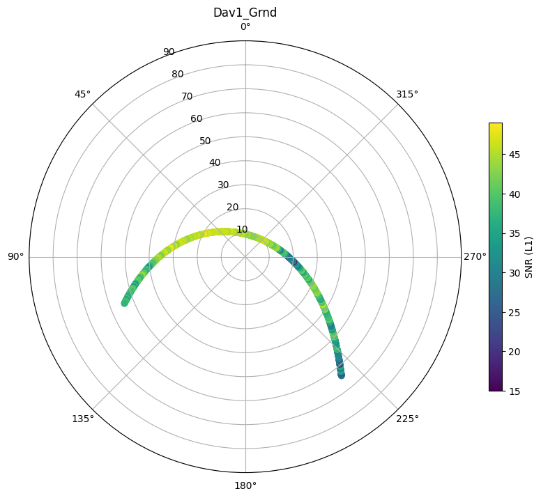
Single satellite, single site
mySV = 'E03'
mystation_name = 'Dav1_Grnd'
# initialize figure with polar axes
fig, ax = plt.subplots(figsize=(10,10),subplot_kw=dict(projection='polar'))
# subset the dataset
subdf = df.xs(mySV,level='SV').xs(mystation_name,level='Station')

# polar plots need a radius and theta direction in radians
radius = 90-subdf.Elevation
theta = np.deg2rad(subdf.Azimuth)

# plot each measurement and color by signal to noise ratio
hs = ax.scatter(theta,radius,c=subdf.S1)
ax.set_rlim([0,90])
ax.set_theta_zero_location("N")
plt.colorbar(hs, shrink=.5, label='SNR (L1)')
plt.title(mystation_name)
Text(0.5, 1.0, 'Dav1_Grnd')
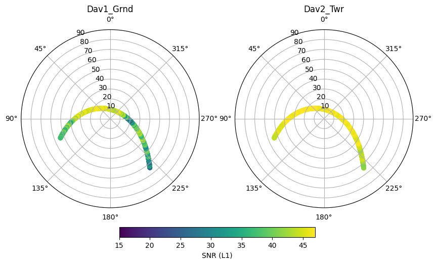
Single satellite, all sites
mySV = 'E03'
# get all sites as list
station_names = df.index.get_level_values('Station').unique()
# ensure we use the same color limits in all plots
clim = [15,47]
# initialize figure with polar axes
fig, ax = plt.subplots(1,len(station_names),figsize=(10,10),subplot_kw=dict(projection='polar'))
for i, iname in enumerate(station_names):
    # subset the dataset
    subdf = df.xs(mySV,level='SV').xs(iname,level='Station')
    # polar plots need a radius and theta direction in radians
    radius = 90-subdf.Elevation
    theta = np.deg2rad(subdf.Azimuth)
    # plot each measurement and color by signal to noise ratio
    hs = ax[i].scatter(theta,radius,c=subdf.S1)
    hs.set_clim(clim)
    ax[i].set_rlim([0,90])
    ax[i].set_theta_zero_location("N")
    ax[i].set_title(iname)

plt.colorbar(hs, ax=ax, location='bottom', shrink=.5, pad=0.05, label='SNR (L1)')
<matplotlib.colorbar.Colorbar at 0x7f42cd141910>
All satellites, all sites
# get all sites as list
station_names = df.index.get_level_values('Station').unique()
# ensure we use the same color limits in all plots
clim = [15,47]
# initialize figure with polar axes
fig, ax = plt.subplots(1,len(station_names),figsize=(10,10),subplot_kw=dict(projection='polar'))
for i, iname in enumerate(station_names):
    # subset the dataset
    subdf = df.xs(iname,level='Station')
    # polar plots need a radius and theta direction in radians
    radius = 90-subdf.Elevation
    theta = np.deg2rad(subdf.Azimuth)
    # plot each measurement and color by signal to noise ratio
    hs = ax[i].scatter(theta,radius,c=subdf.S1,s=10)
    hs.set_clim(clim)
    ax[i].set_rlim([0,90])
    ax[i].set_theta_zero_location("N")
    ax[i].set_title(iname)

plt.colorbar(hs, ax=ax, location='bottom', shrink=.5, pad=0.05, label='SNR (L1)')
<matplotlib.colorbar.Colorbar at 0x7f42cc077af0>
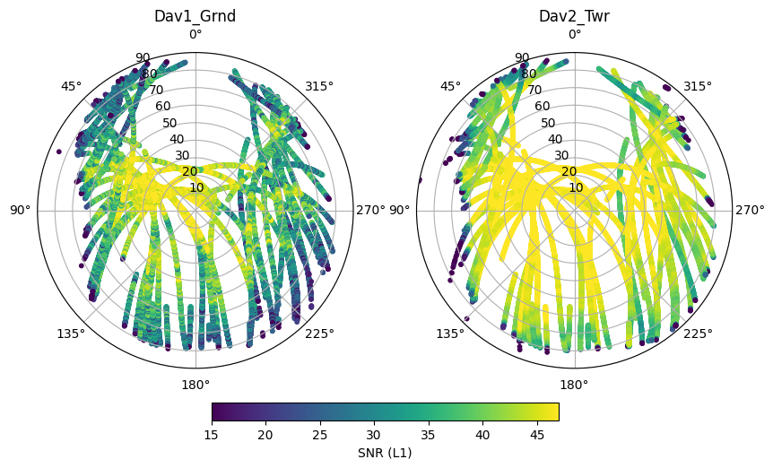
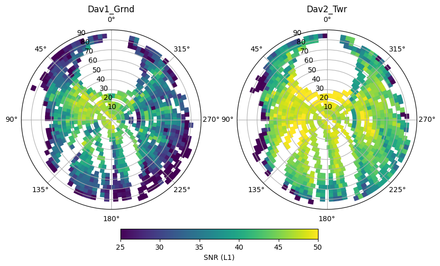
As expected, signal to noise is larger at the clear-sky (Dav2_Twr) site. We also see that SNR increases as a function of elevation. This mainly occurs because the GNSS antenna gain is strongest in the zenith direction.
We also see that no measurements can be found towards the North of the stations, this is because no GNSS satellites go over this area of the sky.
Finally, to the West, measurements are missing below elevations of about 20°. This is because the surrounding terrain and the mountains are cutting off the line of sight to the satellite.
Plotting observation points as time series
mySV = 'E03'
# get all sites as list
station_names = df.index.get_level_values('Station').unique()

fig, ax = plt.subplots(1,figsize=(10,5))
for i, iname in enumerate(station_names):
    # subset the dataset
    subdf = df.xs(iname,level='Station').xs(mySV,level='SV')
    # plot each measurement and color by signal to noise ratio
    hs = ax.plot(subdf.index.get_level_values('Epoch'),subdf.S1,label=iname)

myFmt = mdates.DateFormatter('%H:%M')
ax.xaxis.set_major_formatter(myFmt)
ax.set_ylabel('SNR (L1)')
ax.legend()
plt.title(mySV)
Text(0.5, 1.0, 'E03')
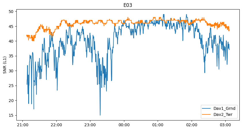
Here we see several interesting features. In the beginning, the SNR of the clear-sky antenna (Dav2_Twr) increases over time as the satellite gets closer to the zenith, then starts to decrease after passing zenith.
We also observe oscillations of the clear-sky signal. These are likely the result of ground multipath reflections. The ground reflected signal reaches the receiver with a delay, causing an either constructive (signal enhancement) or destructive (signal attenuation) interference, in alternance as the satellite rises in the sky.
Finally, we see that the signal is severely attenuated at the subcanopy site, as the satellite is obscured by more or less dense parts of the canopy. Around 00:00-02:00 the satellite likely was moving through a gap in the canopy and the signal strength is more or less the same at the two receivers.
Geostationary satellites
Some of the logged satellites are geostationary (meaning they stay in the same spot in the sky) and have an “S” as prefix. These are satellites of the regional Satellite-based Augmentation Systems (SBAS), here the European Geostationary Navigation Overlay Service (EGNOS). These satellites broadcast correction information calculated in real time, which improves positioning (if your GNSS receiver has the ability to receive it).
As they have a fixed position in the sky, they do not sample the whole canopy. As a result, their signals are much more constant over time.
mySV = ['S23','S36']
# get all sites as list
station_names = df.index.get_level_values('Station').unique()

fig, ax = plt.subplots(len(mySV),figsize=(10,10))
for isv, svname in enumerate(mySV):
    for i, iname in enumerate(station_names):
        # subset the dataset
        subdf = df.xs(iname,level='Station').xs(svname,level='SV')
        # plot each measurement and color by signal to noise ratio
        hs = ax[isv].plot(subdf.index.get_level_values('Epoch'),subdf.S1,label=iname)

    myFmt = mdates.DateFormatter('%H:%M')
    ax[isv].xaxis.set_major_formatter(myFmt)
    ax[isv].set_ylabel('SNR (L1)')
    ax[isv].legend()
    ax[isv].set_title(svname)
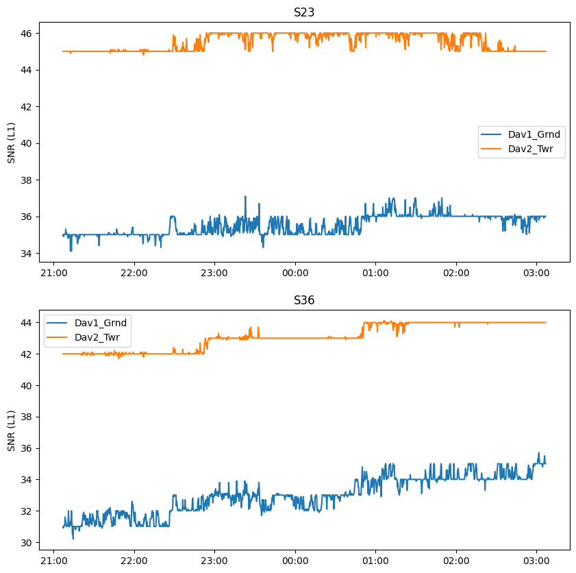
Those measurements can be useful to diagnose other possible effects on SNR. For instance, the density of the atmosphere has an effect on SNR which can change over the day and will influence both stations similarly. The temperature of the sensing equipment (receiver, cables, antenna) can also vary over the day and have a small influence on SNR.
The plateaus occurs because the SNR is encoded as an integer on the Reach M2 receiver. We are logging data every second, but we averaged to 15 seconds during preprocessing, explaing why we also have intermediate values.
mySV = 'S27'
# get all sites as list
station_names = df.index.get_level_values('Station').unique()

fig, ax = plt.subplots(1,figsize=(10,5))
for i, iname in enumerate(station_names):
    # subset the dataset
    subdf = df.xs(iname,level='Station').xs(mySV,level='SV')
    # plot each measurement and color by signal to noise ratio
    hs = ax.plot(subdf.index.get_level_values('Epoch'),subdf.S1,label=iname,marker='.',markersize=5)

myFmt = mdates.DateFormatter('%H:%M')
ax.xaxis.set_major_formatter(myFmt)
ax.set_ylabel('SNR (L1)')
ax.legend()
plt.title(mySV)
Text(0.5, 1.0, 'S27')
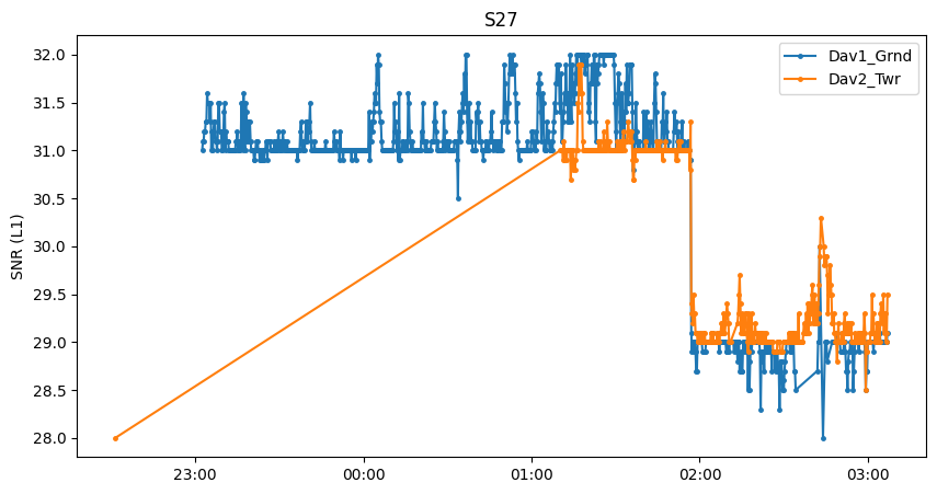
For this geostationary satellite, there is an outlier at about 22:30 for Dav2_Twr, causing a rather awkward time series.
If a satellite is barely visible or has poor health, the receiver may lose track of the signal for some amount of time (a loss of signal tracking is seen for Dav1_Grnd around 02:30 for instance).
Since both receivers record similar signal strength, it is most likely that the geostationary satellite appears in a gap in the canopy and the subcanopy receiver has a clear line of sight as well.
We also see a significant jump at around 01:50. This happens if the transmit power of the satellite is changed (for any power management reason). Such jumps also occur with normal (non-geostationary) satellites but may be less obvious to detect. Because such jumps can occur anytime and on any satellite, it is always recommended to calculate the signal attenuation caused by the canopy (i.e. the difference between the two sensors) at the level of instantaneous observations. If we took here the average of Dav1_Grnd and compared it to the average of Dav2_Twr, Dav1_Grnd would have higher signal strength, but only because Dav2_Twr did not take as many measurements when ‘S27’ was transmitting at a higher power. In summary, calculate the difference first, then average.
Calculating and plotting hemispheric averages
Note, here because we only use 6 hours worth of data, plotting individual measurements as we did above is still possible. However, when working with larger datasets, this quickly becomes impractical. gnssvod offers a solution to calculate statistics (like an average) over a hemispheric grid.
Hemispheric grid objects
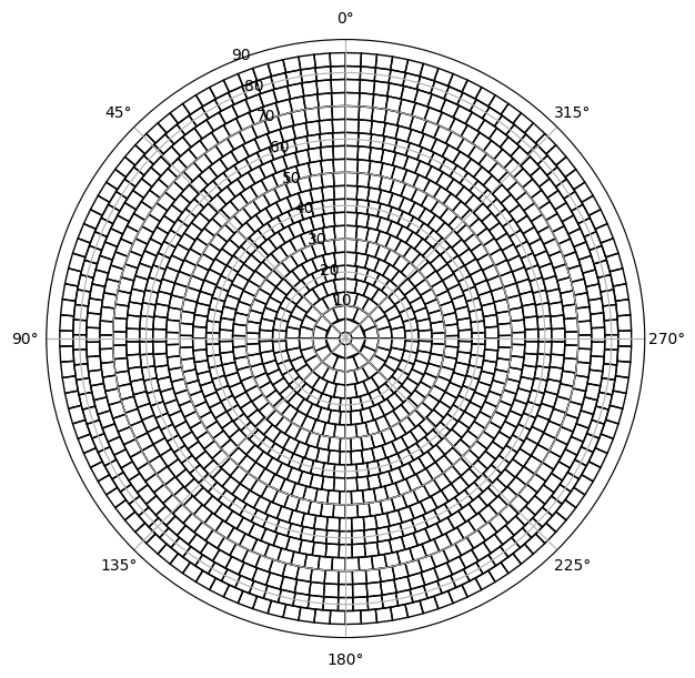
The Hemi class is a convenience class of gnssvod for creating, using, and plotting hemispheric grid objects.
They are constructed by specifying the desired angular resolution of cells in degrees. The smaller the angular resolution, the finer the grid.
hemi = gv.hemibuild(4)
hemi
<gnssvod.hemistats.hemistats.Hemi at 0x7f42b55bc070>
Hemi object structure
Hemi objects expose a small set of attributes describing the grid geometry,
as well as helper methods to work with hemispheric binning.
Attributes
Hemi.angular_resolution
Angular diameter of the zenith cell (degrees).Hemi.ncells
Total number of grid cells in the hemisphere.Hemi.grid
pandas.DataFramedescribing cell geometry (centers and edges).
Methods
Hemi.patches()
Returns apandas.Seriesof matplotlib patches representing grid cells, typically used for hemispheric plotting.Hemi.add_CellID()
Assigns hemispheric CellIDs to an existing dataframe of GNSS observations, enabling spatial binning and statistics.
hemi.grid
| azi | ele | azimin | azimax | elemin | elemax | |
|---|---|---|---|---|---|---|
| CellID | ||||||
| 0 | 0.000000 | 90.0 | 0.000000 | 360.000000 | 88.0 | 90.0 |
| 1 | 22.500000 | 86.0 | 0.000000 | 45.000000 | 84.0 | 88.0 |
| 2 | 67.500000 | 86.0 | 45.000000 | 90.000000 | 84.0 | 88.0 |
| 3 | 112.500000 | 86.0 | 90.000000 | 135.000000 | 84.0 | 88.0 |
| 4 | 157.500000 | 86.0 | 135.000000 | 180.000000 | 84.0 | 88.0 |
| ... | ... | ... | ... | ... | ... | ... |
| 1523 | 345.789474 | 6.0 | 344.210526 | 347.368421 | 4.0 | 8.0 |
| 1524 | 348.947368 | 6.0 | 347.368421 | 350.526316 | 4.0 | 8.0 |
| 1525 | 352.105263 | 6.0 | 350.526316 | 353.684211 | 4.0 | 8.0 |
| 1526 | 355.263158 | 6.0 | 353.684211 | 356.842105 | 4.0 | 8.0 |
| 1527 | 358.421053 | 6.0 | 356.842105 | 360.000000 | 4.0 | 8.0 |
1528 rows × 6 columns
To plot the grid, we first retrieve the patches:
# get patches
patches = hemi.patches()
patches
CellID
0       Rectangle(xy=(0, 0), width=6.28319, height=2, ...
1       Rectangle(xy=(0, 2), width=0.785398, height=4,...
2       Rectangle(xy=(0.785398, 2), width=0.785398, he...
3       Rectangle(xy=(1.5708, 2), width=0.785398, heig...
4       Rectangle(xy=(2.35619, 2), width=0.785398, hei...
                              ...
1523    Rectangle(xy=(6.00761, 82), width=0.0551157, h...
1524    Rectangle(xy=(6.06272, 82), width=0.0551157, h...
1525    Rectangle(xy=(6.11784, 82), width=0.0551157, h...
1526    Rectangle(xy=(6.17295, 82), width=0.0551157, h...
1527    Rectangle(xy=(6.22807, 82), width=0.0551157, h...
Name: Patches, Length: 1528, dtype: object
Creating the patches can take time, especially if there are many. With an angular resolution of 6° and 693 patches, this is still quite fast, but at 0.1°, it will take a lot of time. This is why patches are only calculated if the method .patches() is called by the user and are otherwise not calculated by default when calling hemibuild
The patches can then be easily plotted as follows:
fig, ax = plt.subplots(figsize=(7,7),subplot_kw=dict(projection='polar'))
pc = PatchCollection(patches.values,facecolor='none',linewidth=1)
#ax.bar(0, 1).remove() # bar hack to force curved patch edges, activate this if the patches look square and not curved
ax.add_collection(pc)
ax.set_rlim([0,90])
ax.set_theta_zero_location("N")
Assigning measurements to grid cells
The Hemi.add_CellID assigns a CellID to an existing dataframe of GNSS measurements.
df = hemi.add_CellID(
    df,
    aziname="Azimuth",
    elename="Elevation",
    idname="CellID",
    drop=True,
)
By default, it will assume that the dataframe df contains columns named Azimuth and Elevation, and that the CellID should be added to a new column named CellID. All these defaults can be easily overriden by manipulating the arguments. drop=True means that measurements that do not fall within in any cell are dropped off (discarded from the df). This can affect a substantial number of observations if an elevation cutoff larger than zero was specified when building the grid with hemibuild.
newdf = hemi.add_CellID(df)
newdf
| S1 | S2 | S7 | Azimuth | Elevation | CellID | |||
|---|---|---|---|---|---|---|---|---|
| Station | Epoch | SV | ||||||
| Dav1_Grnd | 2021-04-28 21:07:00 | C06 | NaN | NaN | 25.0 | 36.6 | 10.1 | 1312 |
| C09 | 35.0 | 35.0 | 30.0 | 49.0 | 32.7 | 690 | ||
| C11 | 33.0 | 33.0 | 30.5 | 177.2 | 35.1 | 724 | ||
| C14 | 36.3 | 36.3 | 35.2 | -96.4 | 76.8 | 42 | ||
| C16 | 30.7 | 30.7 | 30.8 | 38.3 | 15.2 | 1201 | ||
| ... | ... | ... | ... | ... | ... | ... | ... | ... |
| Dav2_Twr | 2021-04-29 03:07:00 | R05 | 49.4 | 39.0 | NaN | 123.8 | 40.1 | 532 |
| R07 | 46.5 | 37.0 | NaN | -44.0 | 20.7 | 1068 | ||
| R09 | 42.4 | 39.3 | NaN | -154.1 | 18.9 | 1143 | ||
| R15 | 50.5 | 40.6 | NaN | 40.7 | 45.7 | 432 | ||
| R16 | 46.4 | 35.7 | NaN | -173.5 | 68.9 | 101 |
80816 rows × 6 columns
It now becomes relatively easy to calculate any sort of statistics per grid cell using the base pandas functions.
hemi_average = newdf.groupby(['CellID','Station']).mean()
hemi_average
| S1 | S2 | S7 | Azimuth | Elevation | ||
|---|---|---|---|---|---|---|
| CellID | Station | |||||
| 1 | Dav1_Grnd | 47.853333 | 43.027273 | 39.0 | 4.746667 | 84.620000 |
| Dav2_Twr | 48.353333 | 43.581818 | 41.0 | 4.746667 | 84.620000 | |
| 3 | Dav1_Grnd | 47.677419 | 41.145161 | NaN | 114.351613 | 84.716129 |
| Dav2_Twr | 48.361290 | 43.958065 | NaN | 114.351613 | 84.722581 | |
| 4 | Dav1_Grnd | 47.925000 | 42.715000 | NaN | 146.860000 | 84.560000 |
| ... | ... | ... | ... | ... | ... | ... |
| 1522 | Dav1_Grnd | 35.250000 | NaN | NaN | -15.933333 | 7.750000 |
| Dav2_Twr | 44.333333 | 35.150000 | NaN | -15.933333 | 7.750000 | |
| 1523 | Dav1_Grnd | 30.300000 | NaN | NaN | -15.700000 | 7.400000 |
| Dav2_Twr | 44.133333 | 35.550000 | NaN | -15.666667 | 7.300000 | |
| 1524 | Dav2_Twr | 36.300000 | NaN | NaN | -9.700000 | 8.000000 |
1779 rows × 5 columns
We can now plot this data in grid form. Here we look at the mean signal to noise ratio (SNR) at each site.
fig, ax = plt.subplots(1,2,figsize=(10,10),subplot_kw=dict(projection='polar'))

station_names = df.index.get_level_values('Station').unique()
for i, iname in enumerate(station_names):
    # associate the mean values to the patches, join inner will drop patches with no data, making plotting slightly faster
    ipatches = pd.concat([patches,hemi_average.xs(iname, level='Station')],join='inner',axis=1)
    # plotting with colored patches
    pc = PatchCollection(ipatches.Patches,array=ipatches.S1,edgecolor='face', linewidth=1)
    pc.set_clim([25,50])
    ax[i].add_collection(pc)
    ax[i].set_rlim([0,90])
    ax[i].set_theta_zero_location("N")
    ax[i].set_title(iname)

plt.colorbar(pc, ax=ax, location='bottom', shrink=.5, pad=0.05, label='SNR (L1)')
plt.savefig('figures/illustration_snr.png',facecolor='white', transparent=False,bbox_inches='tight')
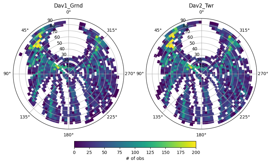
We can also look at the number of observations by calculating another statistic
hemi_count = newdf.groupby(['CellID','Station']).count()
hemi_count

fig, ax = plt.subplots(1,2,figsize=(10,10),subplot_kw=dict(projection='polar'))

station_names = df.index.get_level_values('Station').unique()
for i, iname in enumerate(station_names):
    # associate the mean values to the patches, join inner will drop patches with no data, making plotting slightly faster
    ipatches = pd.concat([patches,hemi_count.xs(iname, level='Station')],join='inner',axis=1)
    # plotting with colored patches
    pc = PatchCollection(ipatches.Patches,array=ipatches.S1,edgecolor='face', linewidth=1)
    pc.set_clim([0,200])
    ax[i].add_collection(pc)
    ax[i].set_rlim([0,90])
    ax[i].set_theta_zero_location("N")
    ax[i].set_title(iname)

plt.colorbar(pc, ax=ax, location='bottom', shrink=.5, pad=0.05, label='# of obs')
<matplotlib.colorbar.Colorbar at 0x7f42b4fcf7f0>
In the next notebook, we illustrate how to calculate and plot GNSS-VOD.